SpudnikLab's Sci-Kit
- Alanis Harjanto
- Jun 10, 2022
- 3 min read
In March, I got the wonderful opportunity to work with SpudnikLab. They were looking for a concept artist, which always rings my bells. They didn't need me to design a fantasy potato creature though, and instead I found myself tasked with doing product visualisation and packaging design concepts for their new product.
SpudnikLab aims to bridge the digital divide, bringing digital literacy to underprivileged individuals and communities to level their socio-economic disadvantages. One of the most interesting things that they do is work with semi-smartphones.

One of these things. If you were born before 2010 you'd know what these are.
This sort of phone does not have a touchscreen and some features that we take for granted in a regular smartphone, but it is able to connect to the Internet and use its functions. It is much more affordable than a regular smartphone, and they run on an operating system called the KaiOS. Spudnik's last project was Kobi, a review platform for KaiOS apps.
Their latest project, though, was one where they needed the concept artist, and that's where I come in. We were to collaborate and brainstorm an idea for a low-cost smartphone-based educational kit. The aim of the kit was to introduce to new users all the capabilities of this type of smartphone.
Saad, the Chief Geek at Spudnik, proposed the idea of a science kit. This way, users would be able to explore the natural world as well as the functions of their phone.
I came up with three concepts: Nature, Electricity/Motors, and Health. Within these three groups I included two to three ideas of what tools might be included.
Nature: Soil monitoring sensor, microscope
Electricity/Motors: Solar panel, fan, RC (remote-controlled) robot
Health: Thermometer, Heart Pulse Oximeter
The fourth option, which was ultimately what we went with, was to mix and match the products we liked. After all, everything was still related to science and would enable the user to learn and use the phone in different ways.
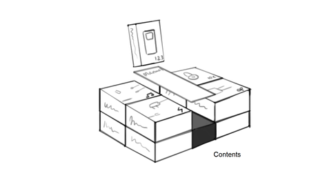
Next it was time to design the Sci-Kit's packaging. I came up with a few sketches.
For the wordmark logo, I chose the typeface, Omnium Medium, because it was a sans-serif that had rounded corners. This makes them very friendly-looking and easily readable. The sans-serif also gives it a modern, possibly even futuristic feel that is very appropriate for a scientific kit. I changed the tittles of the letter 'i's to be electric blue and orange. This was to represent positive and negative charge, as well as hot and cold temperatures. Very scientific.

Saad had also requested that I design some icons to be associated with each product in the kit, so that when they build an app for the kit they could use the same icons in the UI.

I designed the icons to look similar to the typeface I chose, and to be based on a few simple, basic shapes. This makes them consistent and recognisable. The colour was based on the existing brand guidelines Spudnik provided.
The outer box cover used some of these shapes and the blue and orange dots as a repeating pattern. I gave the option of a dark and light version, and in the end the light version was chosen (albeit keeping the sides dark). I think this was the best option too, because the white makes it look lighter, and the dark sides give an interesting contrast.

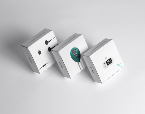
It is much more straightforward to design a concept when all the contents have been decided. For the inner boxes, which would contain the products, I wanted to go for a clean, simple look, and use photographs of the contents to make it clearer for the user.

The inner boxes would also have the dark version as a pattern on the inside, to keep it consistent with the outer box.

Inside cover of the outer box. I think the best part was when I used the x between SpudnikLab and Kobi, while making it still part of the pattern.
This project was very meaningful to me. I enjoyed working on it, not only because I got to try something new, but also because I know that this product would help so many people and impact many lives in a positive way.


Comments